Every year, Queensland Fire and Emergency Services deals with a myriad of natural disasters and emergencies that impact communities across the state. Understanding where, when, and how people move during a disaster is critical to an informed response strategy.
A data-driven approach to response, preparedness, and resilience
Have you ever wondered how emergency services providers and first responders quantify and monitor human movements during an emergency evacuation order or lockdown? The Relational Insights Data Lab teamed up with the Queensland Fire and Emergency Services (QFES) to help them answer these questions. The opportunity to help QFES fill critical data gaps during the early days of the COVID-19 pandemic was part of a larger goal of establishing an all-of-government data-ecosystem that would utilise multiple government departments datasets and share insights.
In a nutshell, a data-ecosystem is a platform that enables multiple organisations to combine data and share insights in a mutually beneficial manner by building and harnessing economies of scale and facilitating a collaborative network of collective intelligence. Data ecosystems can help address the siloing of information. This is not a new problem and it’s a phenomenon that critical bodies like the QFES are not immune to.
QFES conducted an exploratory audit which revealed gaps around adequately quantifying human movement and patterns of behaviours during disasters and relied on sparse and siloed data from their own staff, the Department of Transport and Main Roads, Queensland Police, evacuation centres, and the Australian Red Cross. Therefore, it became our role at the Relational Insights Data Lab (RIDL) to assess whether the DSpark mobility data (a nationally representative and fully anonymised longitudinal telecommunications dataset that extends back to 2017 and with a recency of 60-72hrs) could fill critical information gaps and improve disaster response, preparedness, and build resilience.
RIDL and QFES decided to use the September 2019 fires in Peregian Beach and the COVID-19 lockdowns as case studies and came up with five seemingly basic, but critically important questions:
- Where do people go when an evacuation order is given?
- How long do people take to respond once an evacuation or lockdown order is announced?
- How far do they travel when evacuating? (How far do people travel when a lockdown order is in place?)
- What routes were travelled when the evacuation order was given? (Do people heed recommendations?)
- How long does it take to analyse the data and is there a possibility of real-time application?
The pilot determined that securely accessing DSpark data and developing predictive models would provide opportunities for QFES to make more informed, data-driven decisions to better prepare and respond to future emergencies. To provide examples of how we answered the above questions using the DSpark data, we’ll examine how people moved during the September 2019 Peregian fires and how far people travelled during the initial COVID-19 lockdown in March 2020 compared to the delta variant related lockdown in August 2021.

The Peregian Beach Fires in 2019
Two thirds or 66% of evacuees during a disaster are unaccounted for, or are data-invisible. The question goes begging as to what would you do and where would you go if/when an evacuation order is announced?
The QFES recommendation is to be proactive and have a plan in place, leave the evacuated area quickly and safely and, if possible, stay with family, friends, or neighbours, and preferably ones with a good Wi-Fi connection. Evacuation centres are strategically located to assist those displaced. The QFES wanted to know whether people were in fact heeding evacuation orders, where they went, and if evacuation centres were optimally located, were they being utilised and for how long.
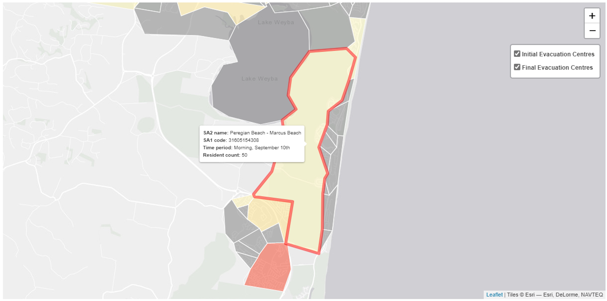
To answer these questions, the RIDL team built a dashboard that geospatially quantified and visualised population movements in an easy-to-digest and actionable manner. Using the dashboard insights, we found that on the first day of the Peregian fires, that 96 people more than average stayed in the Noosa Evacuation Centre area, and they stayed there 3.5 hours longer than average.
Concluding that more people stayed longer lengths of time in areas with evacuation centres when the evacuation order was given, indicated compliance and/or appropriate placement. Additional year-on-year analysis reveals that in 2020, during the initial phases of COVID-19 there was a 4% increase in residents at home during the fire period (September 9th-11th) and a 46% decrease in visitor numbers.
Looking at how long people took to respond in the context of the Peregian Beach fires, our analysis found people started evacuating on the first day of the fires as directed, on the 9th of September. The dashboard heatmap and graph visualised the dip in residents on day two of the fire after evacuation orders were in place. Using filter functions when comparing periods of the day, it is possible to quantify that there was a 49.5% decline in residents at home relative to the previous morning, signifying that evacuation orders were promptly heeded. Thus, demonstrating that our analysis definitively showed the movement of people in affected areas, lengths of stay, and how people responded to evacuation and lockdown orders.
Did people adhere to COVID-19 lockdown orders and reduce their travel ?
When establishing the duration and strictness of the lockdown orders during the first eighteen months of the pandemic, Queensland policy makers and public health officials wanted to understand whether their messaging was clear, and orders were being followed.
Agencies wanted to understand compliance and/or pandemic fatigue. The World Health Organisation defines pandemic fatigue as the demotivation to follow recommended protective behaviours, emerging gradually over time and affected by a number of emotions, experiences, and perceptions. The DSpark data helped RIDL and the agencies understand if Queenslanders were losing their will to comply over time. We measured the magnitude of, and distance travelled by, people to five major shopping centres around the greater Brisbane area to see if this:
- changed during lockdowns,
- whether this change was consistent or varied across subsequent lockdowns, and,
- whether Queenslanders were exhibiting signs of compliance or pandemic fatigue.
The animation below visualises mobility data presented as a heatmap with the colour density illustrating the magnitude of people seen at Chermside shopping centre based on the geographic spread of their home locations.
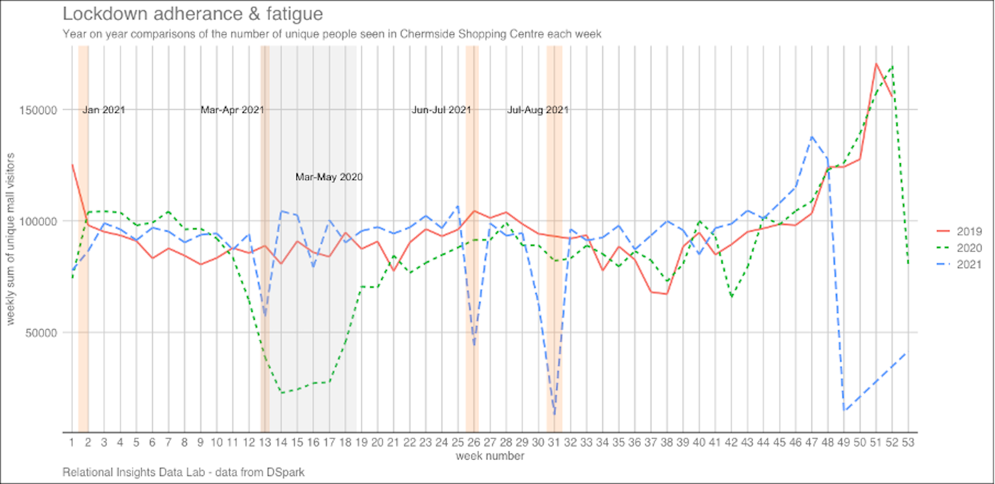
To standardise the pre, post, and across lockdown comparisons, we compared the same Wednesdays in March across 2019, 2020 and 2021, and in doing so it becomes immediately clear that during the first COVID-19 lockdown in March 2020, both the magnitude and distance people travelled contracted dramatically.
However, when we undertake the same analysis during the July – August 2021 lockdown which was ordered due to cases of the new and highly contagious delta variant, we see an even more severe contraction, suggesting that despite it being the fourth lockdown in 2021, Queenslanders were even more compliant than they were during the previous lockdowns.
To establish further context, we honed in on the Easter 2021 lockdown which was surrounded by ‘less austere’ messaging and focused on the day of the contraction and examined the number of people and median distance travelled to Chermside on equivalent Wednesdays going back two months in 2021 and 2019 when there were no lockdowns.
Despite the drop being less pronounced when compared to other lockdowns, this also showed us that the number of people dropped significantly on the lockdown Wednesday (week 13) in 2021. The distance travelled to the shopping centre also dropped from a median distance of 3km at the longest median distance to 2km on lockdown day.

The ability to fill the current data gaps by quantifying peoples movement during emergency situations is key to improving disaster response and preparedness. The data-ecosystem pilot demonstrated that telecommunications data brought to life in an actionable dashboard, like the one built by our team at RIDL can bridge some of the data silos and help fill the data and evidence gaps faced by QFES to improve disaster responses and assist in the recovery, rebuild and reconnection of resilient Queensland communities after a disaster.
With another summer disaster season upon Queensland, please consider putting a disaster evacuation plan in place. The QFES provides considerable advice and suggestions to help you do so.
Author

Rhetta Chappell is a Data Scientist in the Relational Insights Data Lab at Griffith University. Rhetta designs and builds intuitive and innovative solutions that enable users to make data-driven decisions using quantitative and qualitative analysis methods. Rhetta has a background in data analytics, statistical standards, data collection, reporting and survey design. Originally from Canada, she previously worked for the National Centre for Vocational Education Research as researcher and project officer.
